Last updated: 29th Jul 2015 (Version 1.6)
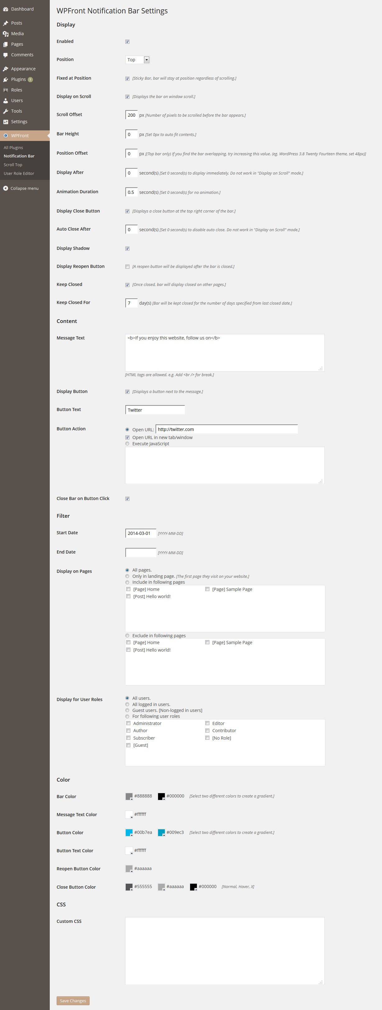
Enabled: Easily lets you enable or disable the bar on your website. No need to activate/deactivate the plugin.
Position: The position (top/bottom) of the bar on your website.
Fixed at Position: The bar will be always visible (sticky bar) on its position. The bar will not scroll with the window.
Display on Scroll: The bar will be displayed when the user starts to scroll on the window.
Scroll Offset: Number of pixels to be scrolled before the bar appears.
Bar Height: The height of the bar in pixels. Setting this value to zero will make the bar auto fit its contents.
Position Offset: Allows you to set an offset to the bar from its default position. Useful when you have other sticky/static content overlapping with the bar. Set this value equal to the height of the sticky/static content to get rid of overlapping. For example WordPress 3.8 Twenty Fourteen theme has the menu/search bar set to static which will make it to overlap with notification bar. Set the height (48px) of the menu/search static bar as the position offset to fix this issue.
Note: This option only applies to Top Bar.
Display After: The number of seconds bar will wait before it appears on the page. Setting this value to zero make the bar visible as soon as the page loads. This option has no significance when the bar is set to display on scroll.
Animation Duration: The number of seconds animation (slide up/slide down) will take to display/hide the bar. Set this value to zero for no animation.
Display Close Button: Displays a close button for the page visitor to easily close the bar.
Auto Close After: The number of seconds before the bar will auto close. Setting this value to zero will stop the bar from auto closing. This option has no significance when the bar is set to display on scroll.
Display Shadow: Displays a shadow for the bar.
Display Reopen Button: Displays a reopen button once the bar is closed, allowing the user to reopen it.
Keep Closed: Once the bar is closed, it will remain closed on other pages too.
Keep Closed For: Once closed, the bar will be kept closed for the number of days specified in this field.
Message Text: Text that appears on the bar (allows HTML).
Process Shortcode: Processes shortcodes within the message text.
Display Button: Displays a button right next to the message.
Button Text: Label to be display on the button next to the message.
Button Action: The action to be performed on button click. It can open a URL or execute JavaScript. Check the check box below the URL for it to open in a new tab. Check “No follow link” to add ‘rel=”nofollow”‘ for SEO. If JavaScript is executed and if it contain errors, it will fail silently.
Close Bar on Button Click: If checked closes the bar on button action.
Start Date: The date from which the bar will start displaying.
End Date: The date from which the bar will stop displaying.
Display on Pages: Allows you to filter the pages/posts the bar will be displayed on. If you select “Only in landing page”, the bar will be displayed only on the very first page the user visit on your website.
Display For User Roles: Allows you to filter the roles the bar will displayed to. If you select “Guest users”, bar will be only displayed for the users who are not logged into you site. “[No Role]” will be used when the user is logged in, but do not belong to any user role. Use “Enable WP eMember integration” to consider WP eMember plugin users as logged in users.
Bar Color: Color of the bar. (Selecting two different colors will form a gradient.)
Message Text Color: Color of the message text.
Button Color: Color of the button next to the image. (Selecting two different colors will form a gradient.)
Button Text Color: Color of the button label next to the image.
Reopen Button Color: Color of the button displayed for reopening the bar.
Close Button Color: Color of the “close” button in the bar. The first color is used to display the background color of the close button. Second color is used to display the background color when the user mouse over it. The third color is used to set the color of the “X” mark within the close button.
Custom CSS: Use this field to override the CSS settings of the bar. Below are the CSS selectors you can use to modify each element.
/* To modify the entire bar styling */
#wpfront-notification-bar {
}
/* To modify the message styling */
#wpfront-notification-bar div.wpfront-message {
}
/* To modify the button styling */
#wpfront-notification-bar div.wpfront-button {
}
/* To modify the close button styling */
#wpfront-notification-bar div.wpfront-close {
}
/* To modify the top reopen button styling */
#wpfront-notification-bar-open-button.top {
}
/* To modify the bottom reopen button styling */
#wpfront-notification-bar-open-button.bottom {
}

